Before
After
A fictitious redesign of a popular Irish Pub in Cologne, Germany. A new logo, house typeface, consistent brand appearance, business cards, flyers, t-shirts and pint glasses were designed, whereby the menu design was actually printed and put into place.
The redesign should relay the feeling people have in the pub; it's a homey place to relax, have a few pints and a chat. The Black Sheep relaxing on a barstool with a pint in its hand is the visual representation of this feeling.
All the visual elements I drew by hand in an etching, woodcut style to evoke warmth. One of the unique aspects of The Black Sheep, is that they have 11 beers on tap, most of them imported. Most guests are not familiar with the beer, so the menu incorporates scales for hoppiness, maltiness, bitterness and sweetness where applicable as well as brief sentences describing the beer. This not only to provides clarity for the customers, but also to evokes curiosity to try out all the beers that sound appealing.
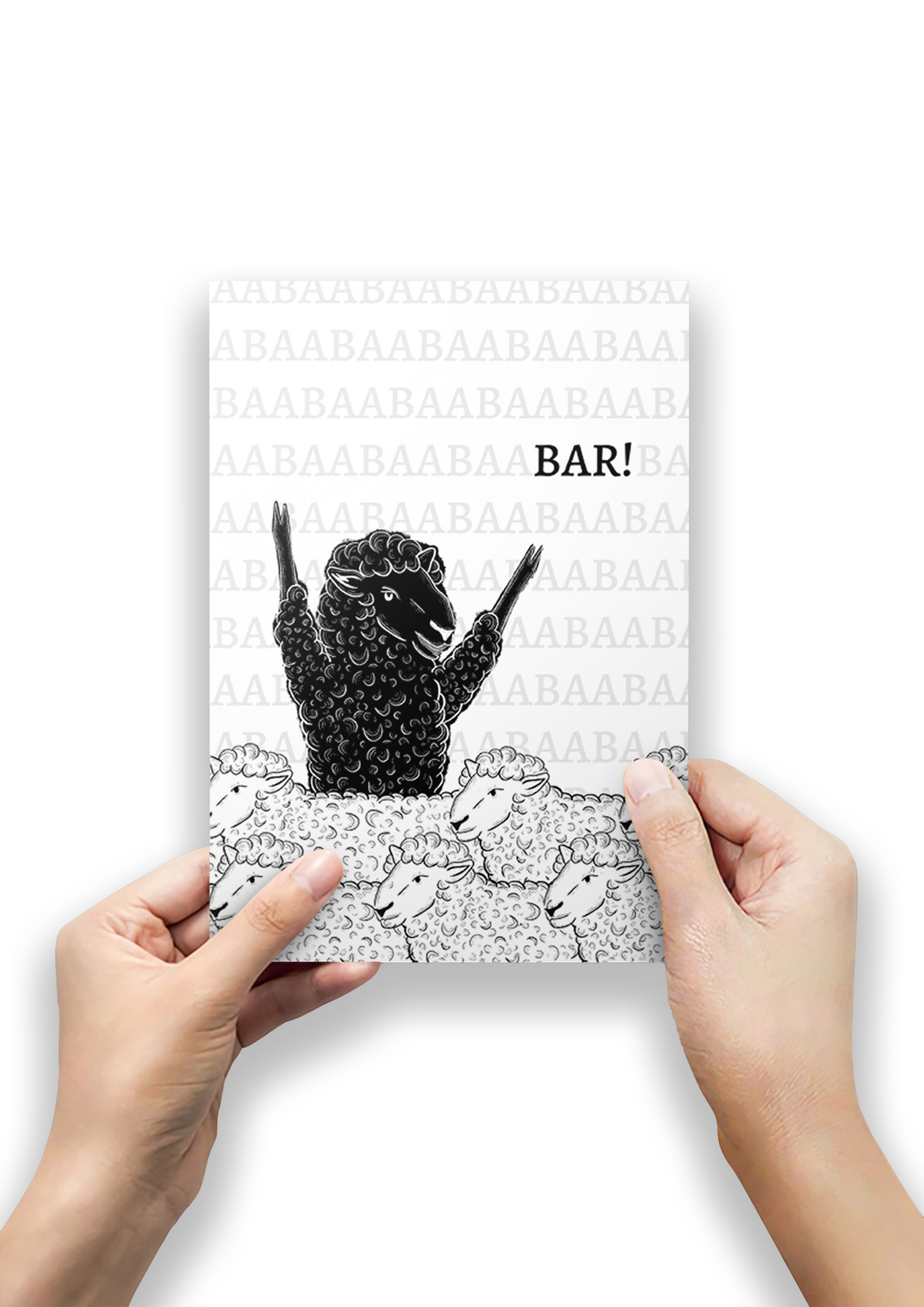
Flyer (Front)
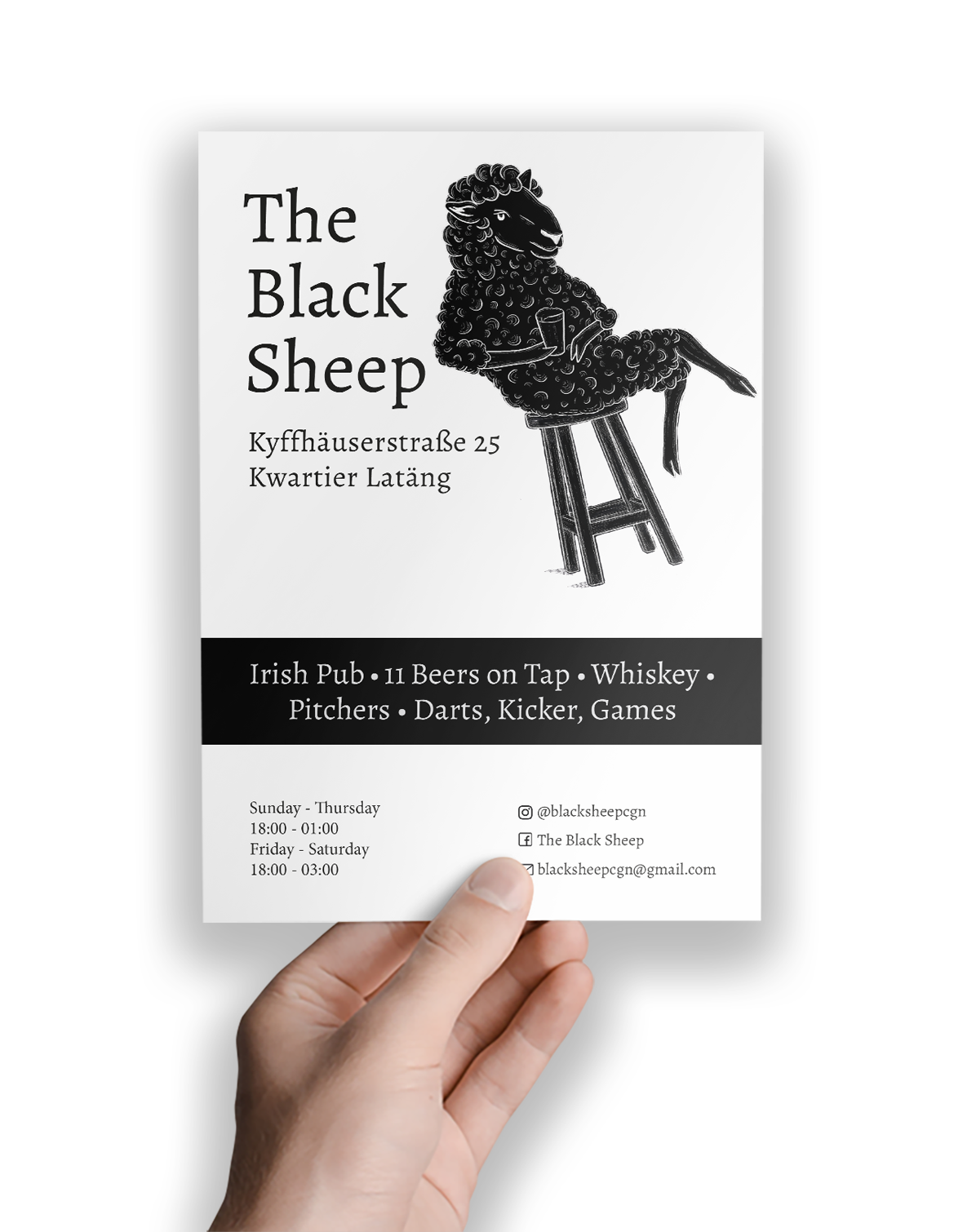
Flyer (Back)
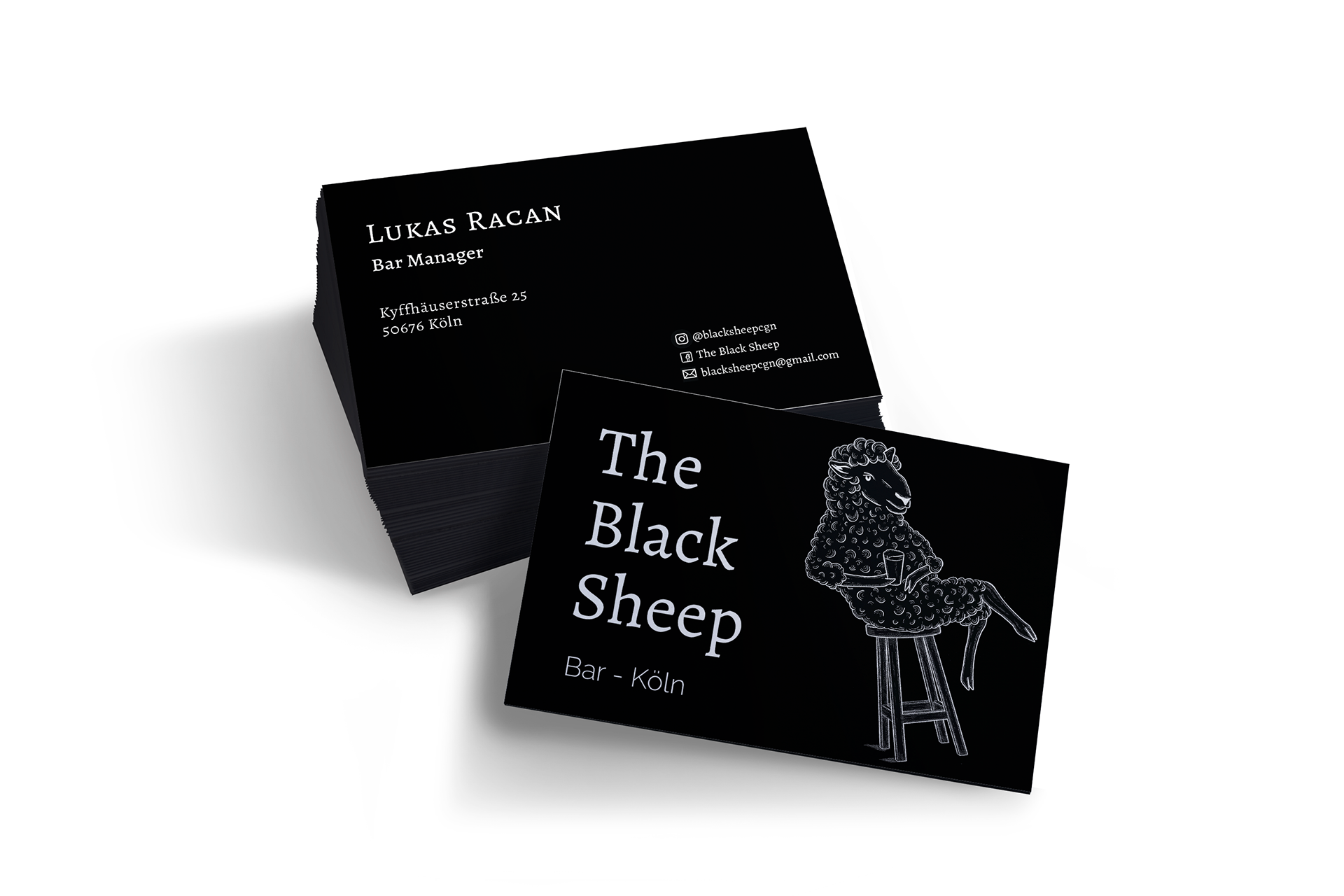
Business Cards
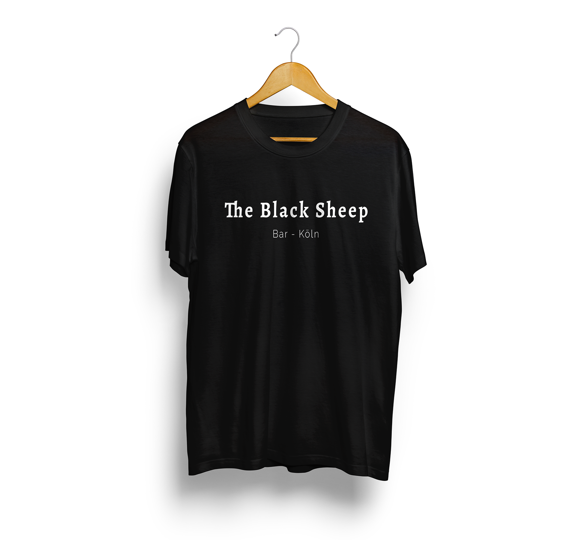
Shirt (Front)
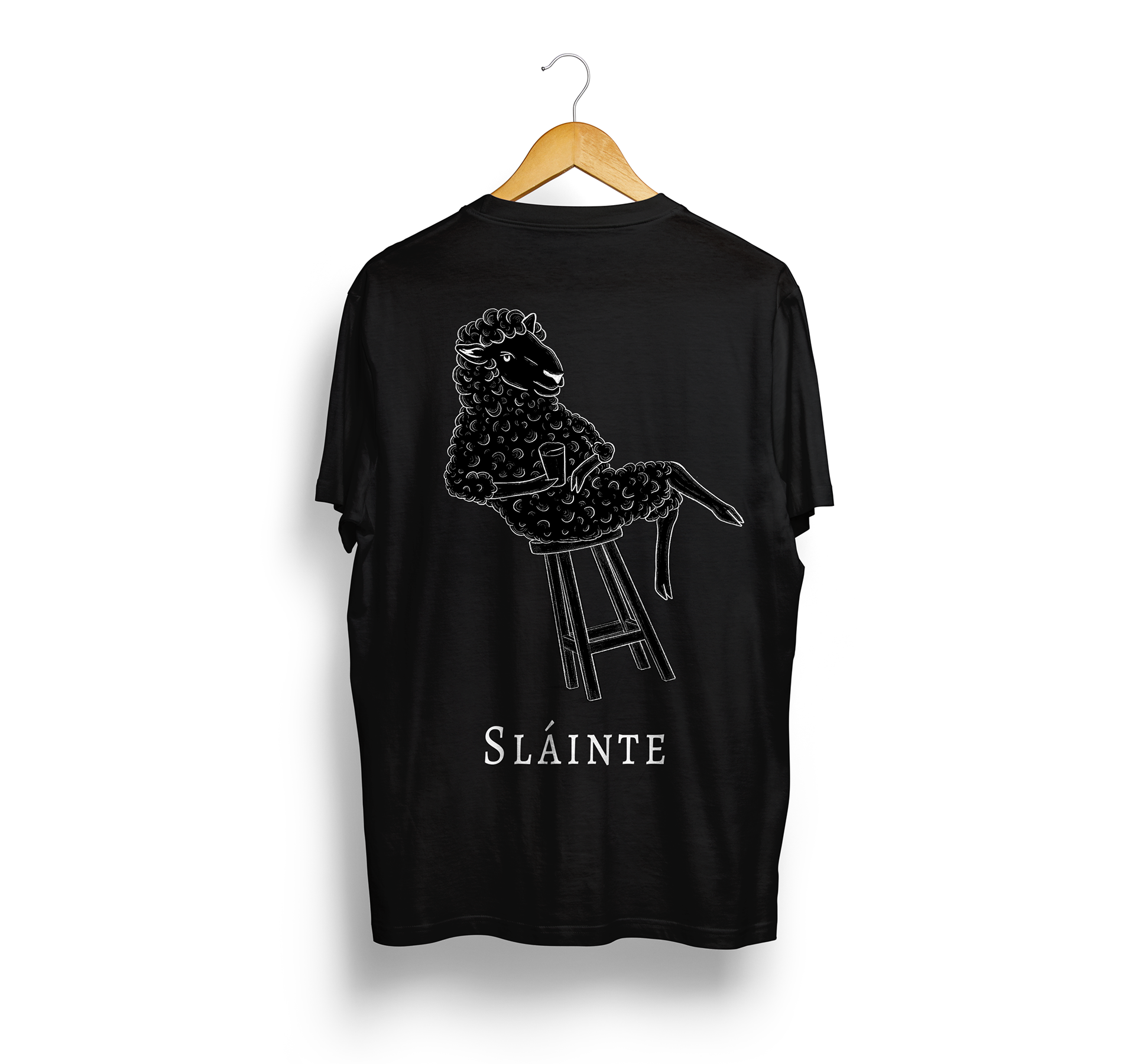
Shirt (Back)
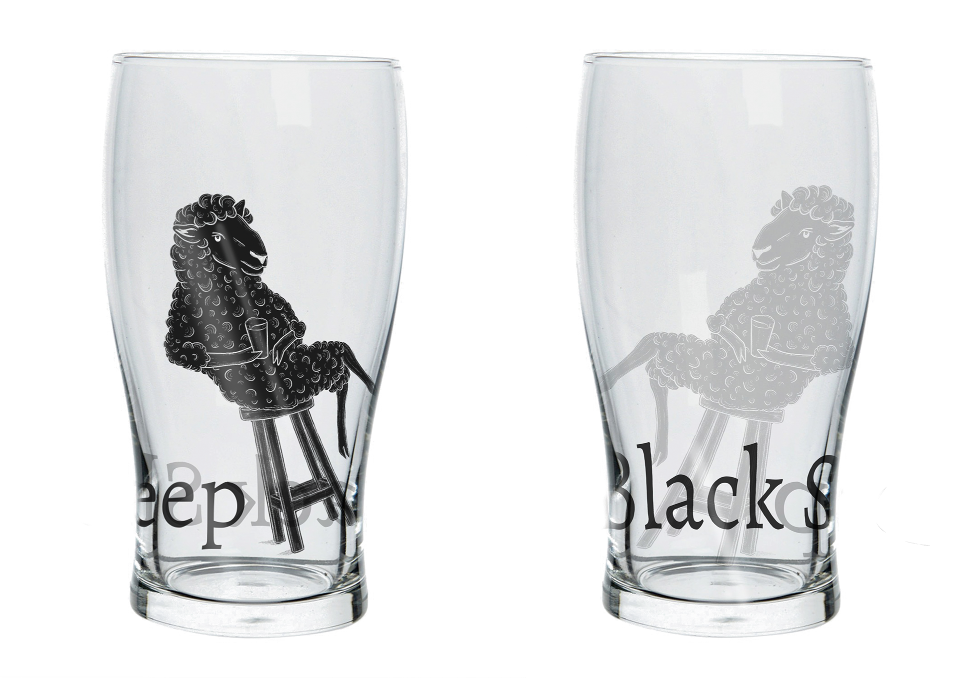
Beer Glass
The Sheep has the famous source of much local pride, the Cologne Cathedral, hidden in its ear.